Yoga Website Design: How to Create a Yoga Website Your Students Will Love
Having a website for your business is a MUST. Whether you’re running your own yoga studio or teaching independently, your students will expect to be able to find you online. That’s exactly why you need to ensure that not only do you have a website but that it incorporates a great yoga website design strategy to help you stand out from the crowd.
Great yoga website design should feel just like your studio—calm, welcoming, and easy to move through. Think clean design, soothing colors, and beautiful visuals that reflect the peaceful vibe of your practice. Make it simple for visitors to find class schedules, learn about your instructors, and book a session online. You might also want to include a blog or articles to share tips and insights about yoga. The goal is to create a space that feels aligned with your studio’s energy from the moment someone lands on your site.
When I meet with potential clients to discuss designing their yoga websites, one of the most common things I hear is that they just don’t know where to begin. What should be included? What platform should they use? How should they spend their budget?
To help address some of these questions and more, I’m doing a deep dive into yoga website design in this article. That way, when you’re ready, you’ll have a clear idea of what to focus on.
Let’s take a look.
Table of Contents
What you need before your yoga website design project
Is your yoga studio virtual or brick and mortar location?
What’s the best yoga studio scheduling software?
What’s the best software for a virtual yoga studio?
Best platform for building a yoga studio website
Search Engine Optimization for Yoga Studio Websites
Yoga website design mistakes (and how to fix them!)
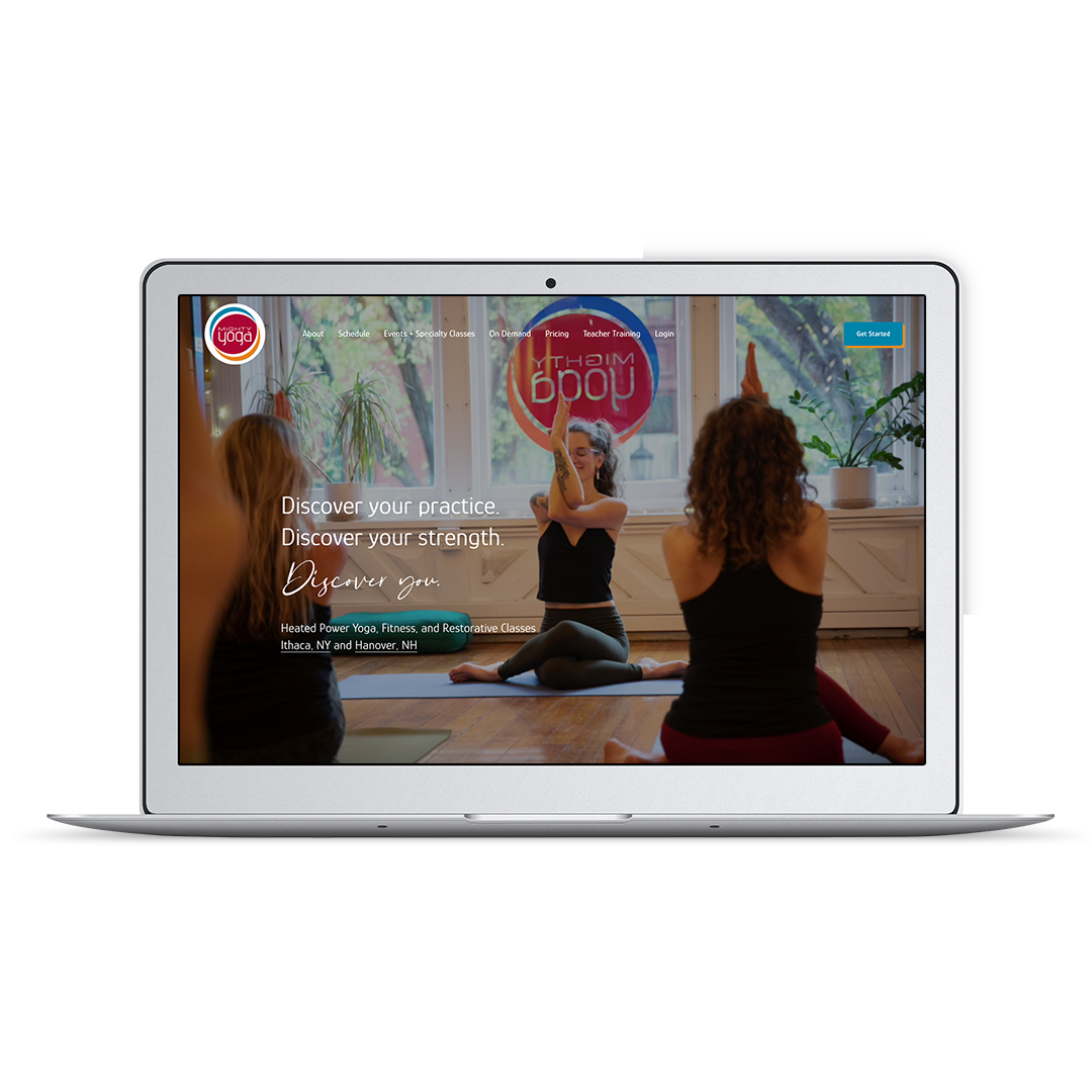
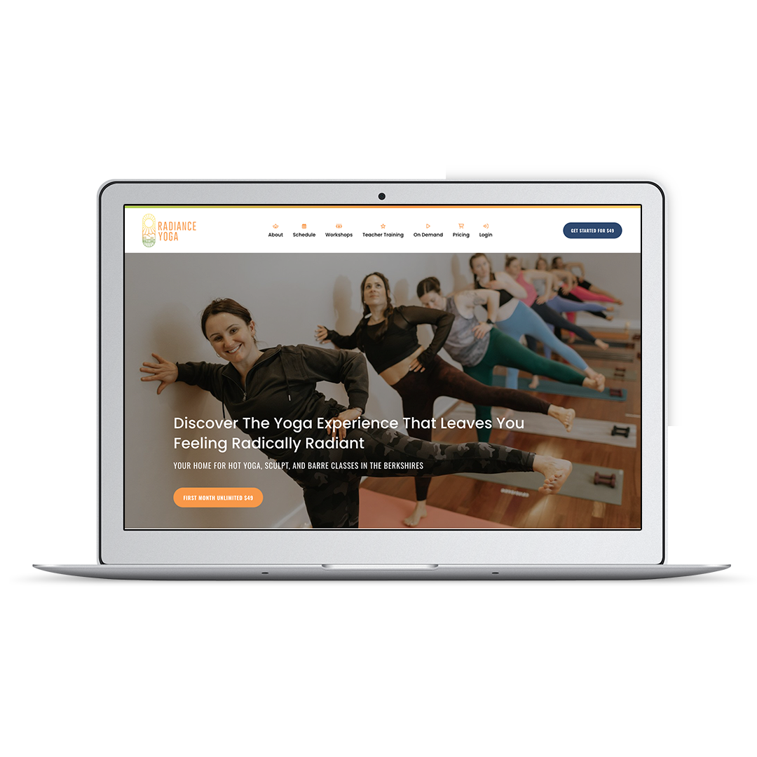
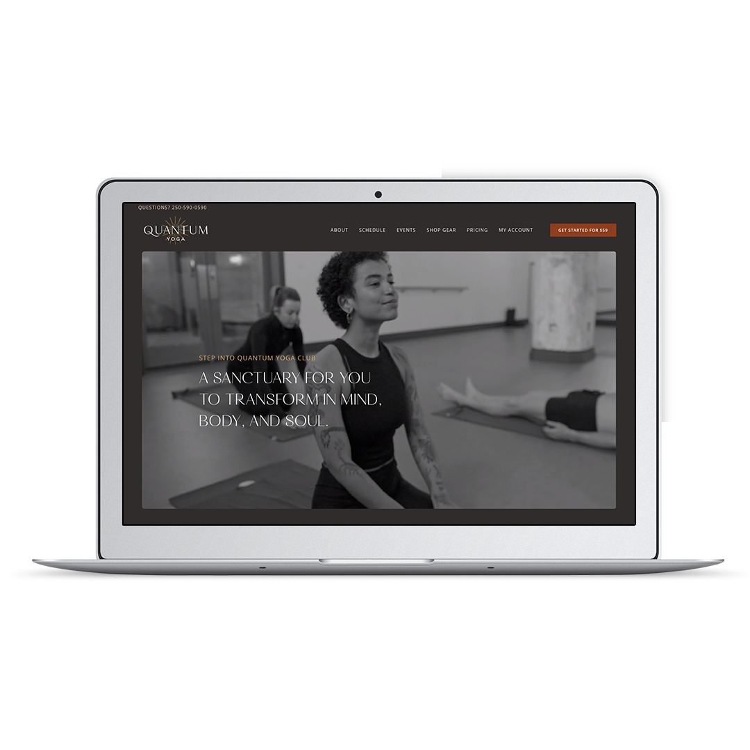
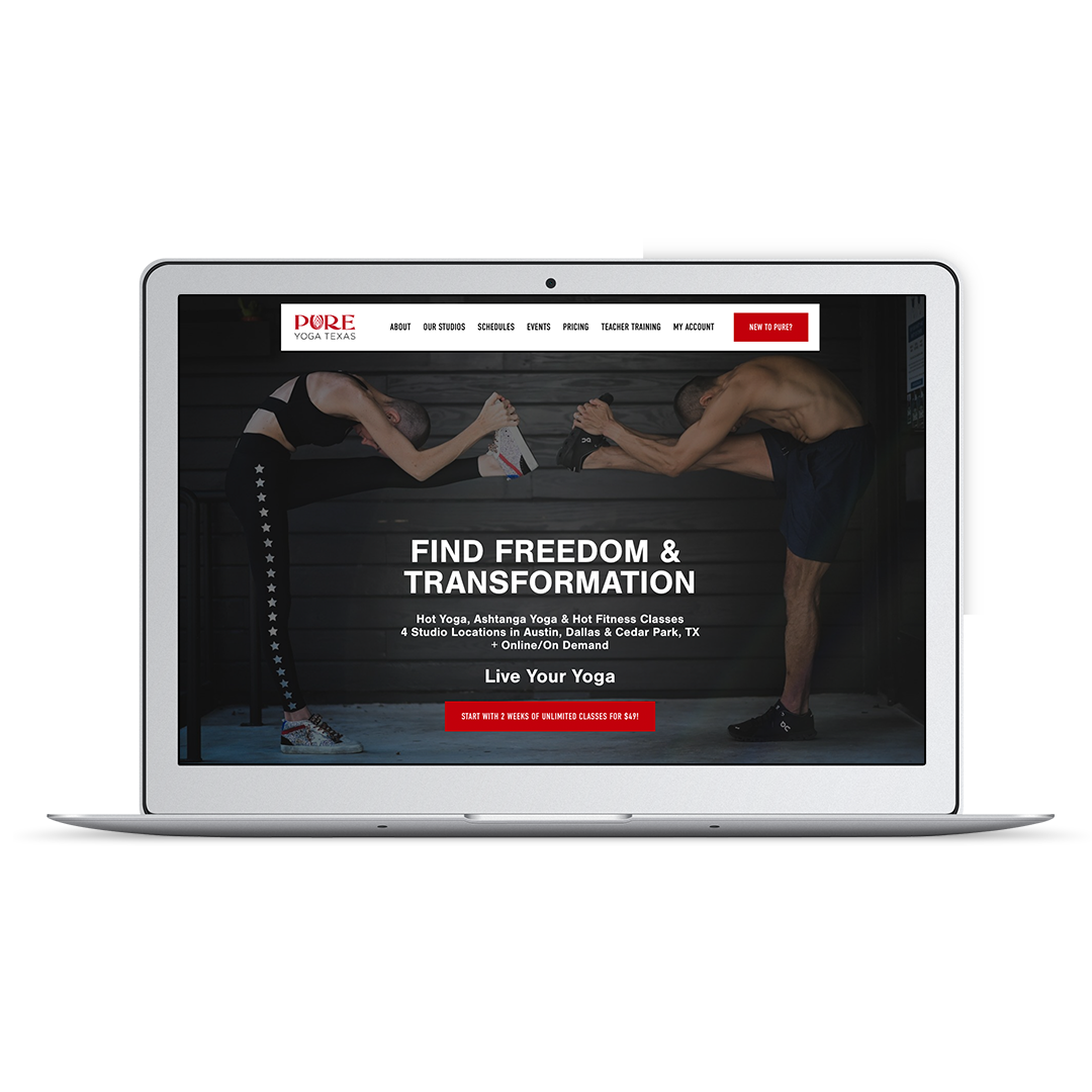
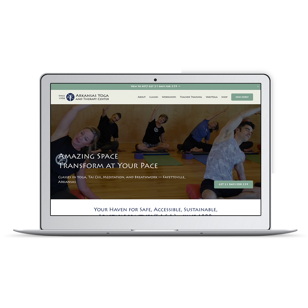
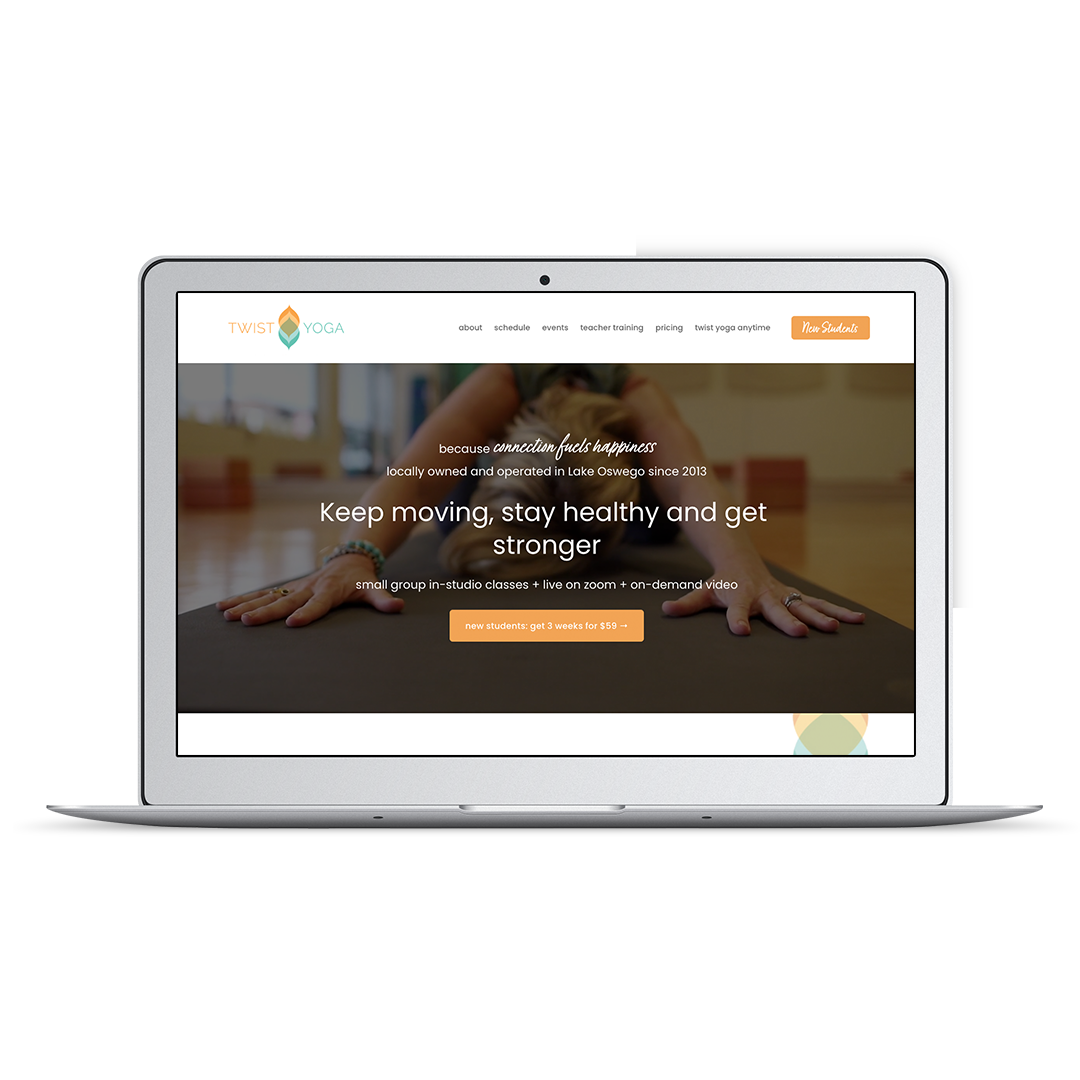
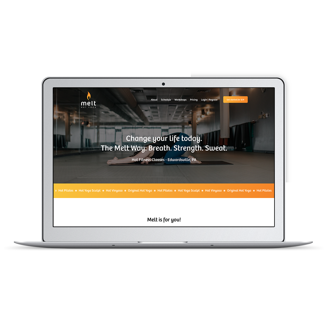
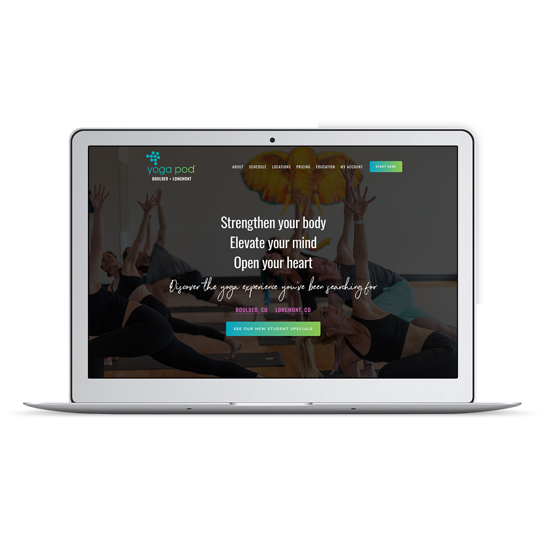
Yoga studio website design examples
Yoga website design FAQs
How to hire a yoga website designer
Interested in Yoga Website Design?
Check out my conversation with Michael Jay on the Yoga Biz Champ podcast. We talk all about 2025 (and beyond!) web design trends and opportunities for yoga studios.
Before You Start Your Yoga Website Design Project
Before you even start your yoga website project, it’s important to note that your website is only as good as the sum of its parts. You may have a team of fantastic instructors, but it doesn't matter how excellent your services are if your yoga website design doesn’t look good and functions appropriately.
When working with clients, four key things should be prepped before the project begins.
#1. Photos
This is one area I always recommend people invest some money in. Hire a local photographer who can capture stunning images of your space, community, yoga classes, and services.
Photos can go a long way to convey the vibe and feel you want people to get from your yoga website design. You’ll want various photos that represent what your business does.
#2. Text
Your website will need copy, which is simply text intended to persuade someone to purchase, sign up, or take the desired action. Copywriting is a highly targeted style of writing that focuses on the reader, their goals, and demonstrating how you can provide what they’re looking for.
You’ll want to nail down your brand messaging before working on your yoga website design, so I recommend starting with your home page.
#3. Visual Brand
People often think visual branding is all about logos, but it’s much more. It’s the colors and fonts you choose, and anything else that will be visually repeated throughout your yoga website design. The purpose of getting this sorted out before you begin the design phase is to establish clear boundaries, allowing you to have a well-defined plan. You want to avoid being stuck looking at a white screen and trying to make a mishmash of things work together.
You want your yoga website design to be visually appealing and getting carried away with colors and fonts can happen before you know it, so you’ll definitely want to make design decisions in the early stages.
#4. Actions
This is where you consider what actions you want students to take when they visit your website. Typically, the goal is to have them book or make a purchase, which is generally linked to your scheduling software. Before you decide which pages will be part of your yoga website design project, take a look at what studio scheduling software you’ll need to incorporate.
What widgets do they offer to bring that scheduling functionality to your website? Can students book appointments and classes on the same page, or will separate pages be required? Your goal is to determine the actions you want students to take and then plan how to incorporate them into your yoga website design.
What Should Be Included in Your Yoga Website Design?
Now that you know what to consider before embarking on a yoga website design, your next step is to ensure you understand what should be included.
Start with your must-have navigation elements — home, about, schedule, pricing, and contact. Other pages or elements can be added later on, but if you want your yoga website design to be effective, this covers all the critical information visitors expect to see.
The next thing you’ll want to include are some testimonials from students who have worked with you. This social proof is a way to give potential students a feel of what it’s like working with you. People are more likely to take action when they have concrete examples of other people doing the same with positive outcomes. Your testimonials can be sprinkled throughout the website wherever it makes the most sense.
Your yoga website design should also include a way to book or buy. Most studios opt for an integrated scheduler, which we’ll discuss below.
Finally, when compiling the list of items for your yoga website design, don’t forget to plan an introductory offer landing page. This landing page has one goal—to present a specific offer in a place where the reader can focus only on it.
One of the most significant benefits of these types of pages is flexibility. You can link directly to this landing page from emails, social media, or anywhere else you’re promoting your offer. Visitors can quickly and easily find all the information they need without having to navigate your entire website to get there.
Your Yoga Studio Website Design: Virtual Studio or In-Person?
Before you can make a yoga website that functions, you need to nail down whether you’ll be working with clients in person or online, or both.
Now, if you’re an independent yoga teacher who books their own clients for private sessions or wants to sell yoga videos, retreats or other programs, you may be wondering if you even need a yoga teacher website at all. Short answer: yes, you absolutely do! While you may be finding clients by promoting yourself on social media, you want to make it as easy as possible to be found through a Google search.
However, if you only teach at a studio, you don’t need a website—your yoga teaching can operate through the studio’s website.
Whether you’re in person or virtual, an independent teacher, or running a studio, you will undoubtedly want some scheduling software. Depending on which route you go with your teaching, that will help determine which scheduling software makes the most sense.
Mindbody vs Walla vs Momence vs FitDEGREE, what’s the best yoga studio scheduling software?
If your yoga website is for a brick-and-mortar studio, you’ll want a scheduler that can keep track of students' class packs and membership usage.
These are the most popular yoga studio scheduling softwares:
Mindbody
Mindbody does a great job at classes, appointments, and enrollments. They offer flexibility for how you structure your offers. Other pros include:
Best choice if you plan to franchise or grow in a big way
Includes payroll management, staff profiles, built-in analytics and reporting, cross-regional set-up.
Mobile app available
Walla
Walla was built from the ground up with a hybrid studio in mind, so you can easily offer both in-studio and livestream classes and video-on-demand classes within the platform. Other pros include:
Modern booking experience.
Virtual and in-person options are seamlessly integrated.
Integrated Marketing Suite
Momence
Momence has emerged in 2024 as the biggest competitor to Mindbody for yoga studios. Momence offers class booking, appointment booking, enrollments and video on demand. Other pros include:
Flexible website widgets that allow customizations and filtering
Reliable support
Integrated Marketing Suite
FitDEGREE
A smaller software company with the most affordable pricepoint in the bunch. FitDEGREE is best suited for independently owned, brick and mortar studios that don’t have virtual offers. Other pros include:
In-app community building social features
Integrated with industry favorite marketing tools
The best support in the industry
Read my full review of the best studio scheduling software in 2025 here.
Arketa vs Momence vs OfferingTree, what’s the best scheduling software for your virtual yoga studio?
For those who are building a completely virtual studio business, you’ll want to look for a platform that offers at least these three key options:
Video Livestream: Livestream classes can be a great option to expand your reach and allow more students into classes that are generally filled to capacity or accommodate students who can’t make it to the studio in person. Classes are delivered in real-time, so students need the ability to sign in so their attendance can be tracked, ensuring they are charged appropriately.
Video on Demand: Made up of pre-recorded videos or classes, workshops, and more that clients can access anytime. This is usually offered as a membership-based product where students can access content as desired.
Video Course Capabilities: On-demand course content is generally designed to be watched in order. Students progress through the curriculum from start to finish and courses are usually sold as a one-time purchase.
While there are plenty of options for this type of scheduling software, when I’m working with clients on yoga website design, I usually recommend one of these three: Arketa, Momence and OfferingTree.
Each of them is an all-virtual studio platform for fitness pros that get close to doing it all: livestream, on-demand memberships, appointments, courses, and video bundles. These three have risen to the top of virtual studio software.
If you’re not sure which one would best suit your purposes, I’d suggest getting a demo of each and see which one fits your business goals best
Squarespace is the Best Yoga Website Builder
Now that you know HOW you’ll be selling, tracking and delivering your classes and instruction, it’s time to build your website! Your website is the place that brings everything together.
Oftentimes I hear from clients that they are intimidated by the tech side of running a business. Still, it absolutely doesn’t need to be an obstacle to creating a profitable yoga business. The yoga and fitness world is constantly evolving and (as we all know!) can change quickly. Being able to shift and adapt quickly as a small business is a superpower and your tech should support this fluidity.
That need for flexibility is a large part of why I recommend Squarespace. It’s easy to manage and works well with all the scheduler and virtual studio software shared above.
A few other things I like about Squarespace:
Great security. Squarespace is a closed platform with a robust security system in place to protect you.
No software updates. The engineers at Squarespace are continually adding updates to your site while you sleep.
Fantastic customer service. Squarespace has real people in a real office in NYC who can always help you.
Cost-effective. Your Squarespace website costs between $12-$18/month.
Want to learn more about how Squarespace works for your yoga website? Check out this video.
Boost Your Yoga Website Design with Search Engine Optimization
Your yoga website design can be completely stunning, but it won’t matter much if people can’t actually find your online presence.
One of your website's most important functions is allowing prospects to easily find you. So your yoga website design and search engine optimization (SEO) are essentially two sides of the same coin. For your website to be effective, design and SEO must be considered.
While there are additional steps you can take to improve your overall SEO—like updating your Google My Business listing—you should also consider improving SEO as part of your yoga website design. Thoughtfully used keywords and phrases will help make your page more searchable and increase the odds of your business being found.
Avoid these Common Yoga Website Design Mistakes (And What To Do Instead)
In my experience, people make four common mistakes when embarking on yoga website design. These mistakes are often a combination of wanting to do too many things and include too many design elements but missing some pieces that are really important to the success of the yoga website design.
These four mistakes are:
#1. Too much clutter
Just like when you walk into a messy room, and you don’t know where to focus, the same thing can happen when you visit a website that has too much going on. The reader doesn’t know where to focus, which can lead them to quickly abandon your website altogether.
When you’re putting together the plan for your yoga website design, ask yourself:
Is it necessary?
Does the page help the visitor do exactly what you want them to?
Would the link be better placed in the footer or on a resource page?
#2. Poor readability
That fancy font looks cool, but is it hard to read? Is there too much text, making it hard for the reader to find the necessary information? Is the color contrast making the text more or less readable? You aim to make your pages as readable as possible, so focusing on details like font size, contrast, and color scheme can make a big difference.
#3. No call to action
Your yoga website design should be crafted in a way that encourages people to take action, but you need to be crystal clear about the next step you want them to take. Whether it’s book a class, sign up for a membership or take advantage of a current promotion, people visiting the website must be able to quickly and easily do so. Each page of your yoga website design should include at least one call to action that leads to the next logical step in their journey.
#4. Inconsistent visuals and messaging
It can be tempting to want to get fancy when working on your yoga website design. But the bottom line is that you’re trying to build trust — and that won’t happen if what they’re seeing doesn’t match what you’re saying. Each design element should be seen as a tool to support the messaging. Some examples of this could be:
If your messaging says you support diversity and inclusion, the photos of your studio and clients should reflect that.
If you’re promoting the high quality of instruction you offer, images of you or other instructors teaching students should be included.
If your messaging mentions how your studio focuses on simplicity, your website should reflect that same value, using crisp, clean design.
Yoga Studio Website Examples
Yoga Website Design FAQ
While many different questions arise throughout the yoga website design process, I want to take a minute to address some that I get frequently.
-
The cost of a yoga website can vary depending on the designer’s experience and skills and the website's size.
A ballpark price for a professional web designer to build your yoga website on a platform like Squarespace or Wordpress and integrate it with your scheduling software is $5,000, however this can vary a lot based on your needs and location.
If you want to learn more about Pixality’s yoga website pricing, you can find more information right here.
-
The answer to this question is… it depends. If you’re a 100% virtual studio that offers online classes or a solo teacher brand, writing blog articles can be very helpful for establishing your expertise and defining a niche on the internet. If your yoga website is for a brick-and-mortar studio location, you’ll want to focus your resources on more locally targeted marketing before spending time on a blog.
-
A well-designed yoga website should include these 6 key pages: Home, About, Schedule, Pricing, New Client, Contact.
You may also want separate pages for your Class Descriptions, Teacher Bios, Workshops and Teacher Training (if applicable).
-
For most yoga studios and solo teachers, Squarespace is an ideal choice. It’s easy to update, integrates with popular scheduling software, and offers clean, modern templates that work well for showcasing your brand and schedule.
-
Excellent photography (and video if possible) is the easiest way to make your website visually engaging and looking modern. Full-width imagery is the hallmark of a modern yoga website design. Keeping Text concise but memorable will also help you achieve the modern look.
-
First, understand that your website is mostly for new people. Your existing clients will likely use an app, or navigate directly to the schedule or events pages without browsing much.
Make your schedule, pricing and New Client Special information obvious and accessible from the main navigation. I highly recommend including a ‘New Client’ page where you can address beginner FAQ’s and explain your Intro Offer in detail.
-
If you’re an independent yoga teacher offering private sessions, workshops, or retreats, yes—you’ll benefit from having your own website. If you only teach at other studios, a personal website is less essential but still helpful for building your brand if you plan to make this a career.
-
If your website was designed with the latest software and with solid design principles, it should last you 4-5 years before you’ll need a major update / refresh project.
That timeline may be shorter if you’re making significant changes to your services, team or classes.
In between redesign projects, review it every quarter at a minimum to keep things fresh and accurate—and to spot opportunities to improve SEO or usability.
Hire a Yoga Website Designer
Now that you know a little more about what goes into yoga website design, you may wonder whether hiring some help is better. However, like everything else, it’s always best to do a bit of research before jumping in with the first website designer you find. By asking some key questions, you can feel more confident with whoever you work with for your yoga website design project.
If you’re looking for a seasoned website designer who works with yoga and fitness studios, Pixality Design can help. Learn more about our yoga website design services right here.
Listen in on stories from some of Pixality’s yoga studio website design clients!


