
Nine Fitness Website Design Ideas for 2025

Are you considering refreshing your boutique fitness studio’s website but unsure which fitness website design ideas to pursue?
Every new year brings new trends in website design, so having a list of fitness website design ideas can be a helpful starting point for keeping your website up-to-date and appealing to potential clients.
Before you begin, it's essential to remember that straightforward, compelling design always remains in style.
Strong fitness website design should do more than just look good—it should make your visitors feel excited to join you. Think bold visuals, easy-to-navigate menus, and interactive features like virtual tours that give people a genuine sense of your space. It’s essential that the site functions well on mobile devices, as most people browse on their phones. Show off what makes your gym unique, highlight client testimonials, and make it super simple to check class schedules or book a session.
Instead of focusing on current trends, consider the core items essential for fitness studio websites and choose the fitness website design ideas that best fit your specific business.
You also want a website favored by search engines, and a great fitness website design coupled with some savvy search engine optimization can help you achieve this online.
Here are nine fitness website design ideas that you can use for inspiration to create a modern and engaging website in 2025 (and beyond!), along with some tips on what to avoid.
Table of Contents
Rather listen? Check out my solo episode on The Boutique Fitness Marketing Podcast to learn more about creating modern, easy-to-navigate boutique fitness website designs. Listen below or on Spotify.
#1. Video Backgrounds
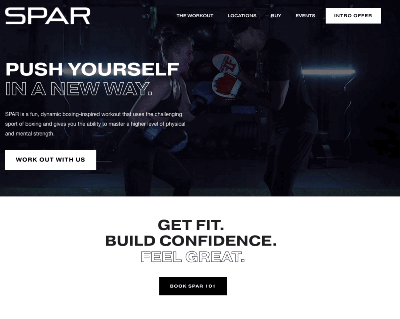
Example: https://www.sparboxingclub.com/
SPAR Boxing uses video backgrounds to show the energy of their fitness class experiences on their website home page.
Short, looping video backgrounds can be one of the most effective fitness website design ideas as you have the opportunity to show what being part of one of your classes really looks like. Video is a compelling medium; potential clients love getting an inside look before making a purchase.
According to a 2021 survey by Lemonlight, 94% of those surveyed indicated that watching a video has helped them make a purchasing decision at least once. By incorporating video backgrounds into your website, you're helping people feel more confident about making decisions.
Tips for using video backgrounds:
Record horizontally
The background video for the main home page banner is usually about 30 sec total, comprised of of 10-15 different clips (2-3 sec clips each)
Single 5-10 sec clips can also be used throughout the site on other section backgrounds as well!
#2. Branded Backgrounds
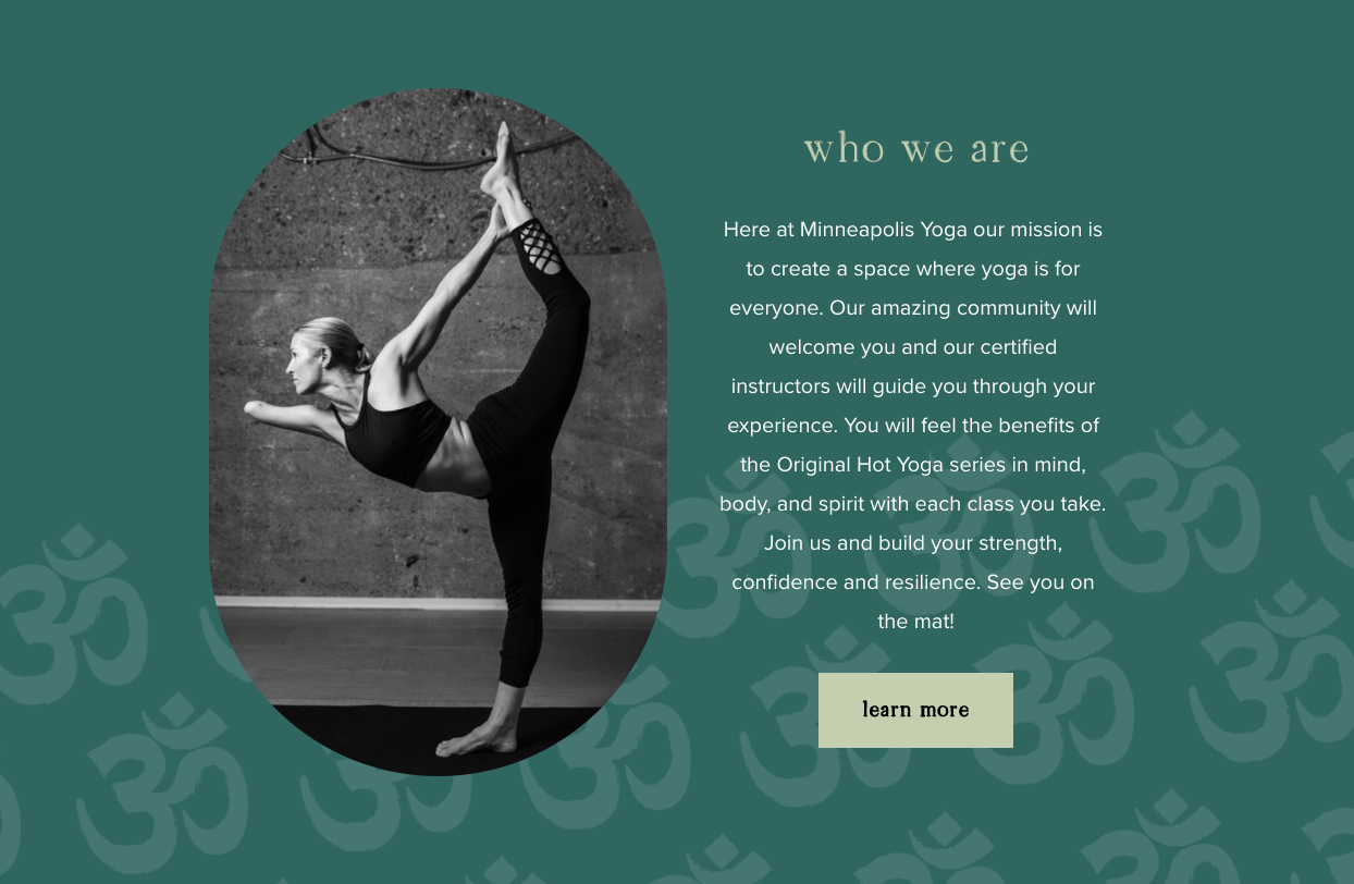
Example: https://www.mpls.yoga/
MPLS Yoga using the symbol from their logo as part of a subtle custom background throughout their site.
Logos help build brand recognition, so consider what design elements you already have when choosing fitness web design ideas.
Do you have a great logo? Consider using it to create subtle custom backgrounds to add visual interest to your website. This cohesive look ties the site together and elevates the brand message.
Tips for created branded website backgrounds
If using the design tool canva, create a new project that’s at least 1500px wide x 1000 px. Make the background one of your darker brand colors and add in a transparent background png image of the graphic portion only of your logo. Use the Opacity tool to fade back the logo graphic and duplicate it and/or resize to make a pattern. Export the artboard as a png and upload to a section on your website. In Squarespace you can adjust the overlay color even further.
#3. Overlapping and Layered Elements
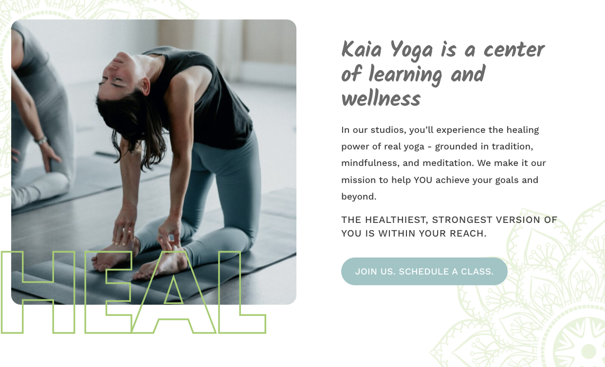
Example: https://www.kaiayoga.com/
Kaia Yoga uses oversized text headings layered on photos for visual interest throughout their site.
Templates are great, but they can sometimes feel rigid. One of the more modern fitness website design ideas is using overlapping text, images, and buttons to break out of the grid and add movement to your layout.
Templates often lack nuanced elements that overlap in just the right way and emphasize the right things. However, design elements arranged in the right way that breaks up the standard grid can make your website look more custom and provide just the right amount of visual interest.
In 2023, we saw this design trend making its way mainstream as website builder Squarespace introduced their new Fluid Engine tool, allowing more flexibility in how elements are arranged on a web page.
You may, however, benefit from working with a fitness website designer who can ensure each element is used effectively and will avoid a situation where you have something busy or distracting.
Tips for using overlapping and layered elements:
Be sure to check your designs on a variety of screensizes and adjust accordingly. What looks great on a desktop screen may cover up something important on a phone!
#4. Subtle Animations
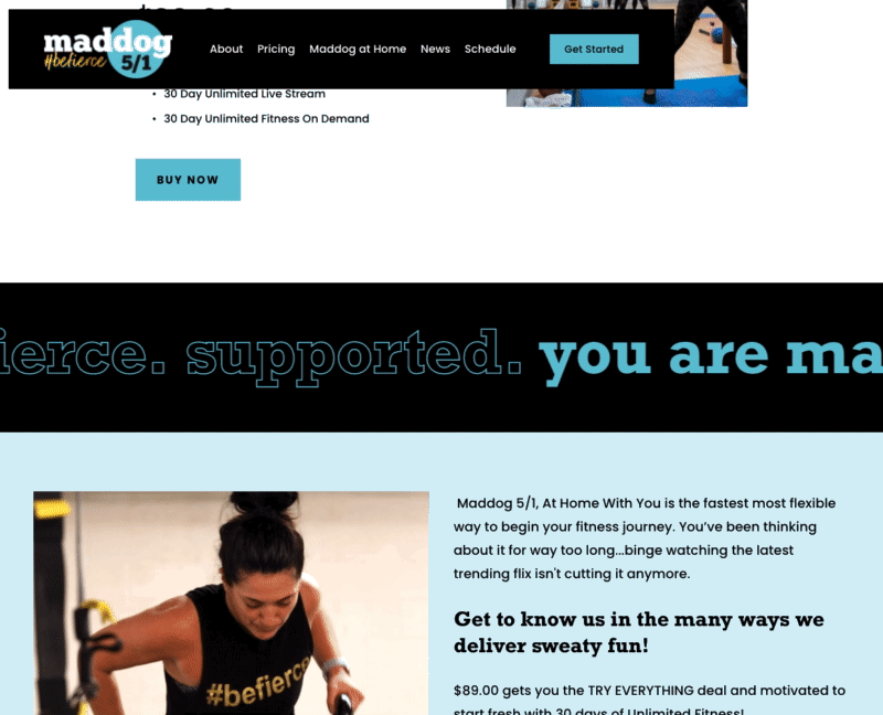
Example: https://www.maddog51.com/
Maddog 5/1 uses a text ticker to highlight core brand messaging, and provide a visual break to sections heavy with paragraph text.
Most fitness and yoga studios are known for being energetic and fun places, so why consider leveraging some fitness website ideas that reflect that?
The use of animation on websites isn't new; however, technology has evolved significantly over the past decade, making it easier than ever to incorporate animation.
One way to do this is via subtle animations, where photos and text slide into view as you scroll down the page. I also love hover effects on buttons to make your site more interactive and engaging.
Tips for adding subtle animations:
Look for what your platform offers natively first. For example, Squarespace now offers the ability to add scrolling text blocks right in the platform interface. You may also want to work with a fitness website designer who can add more advanced animations through custom coding.
#5. Accessibility
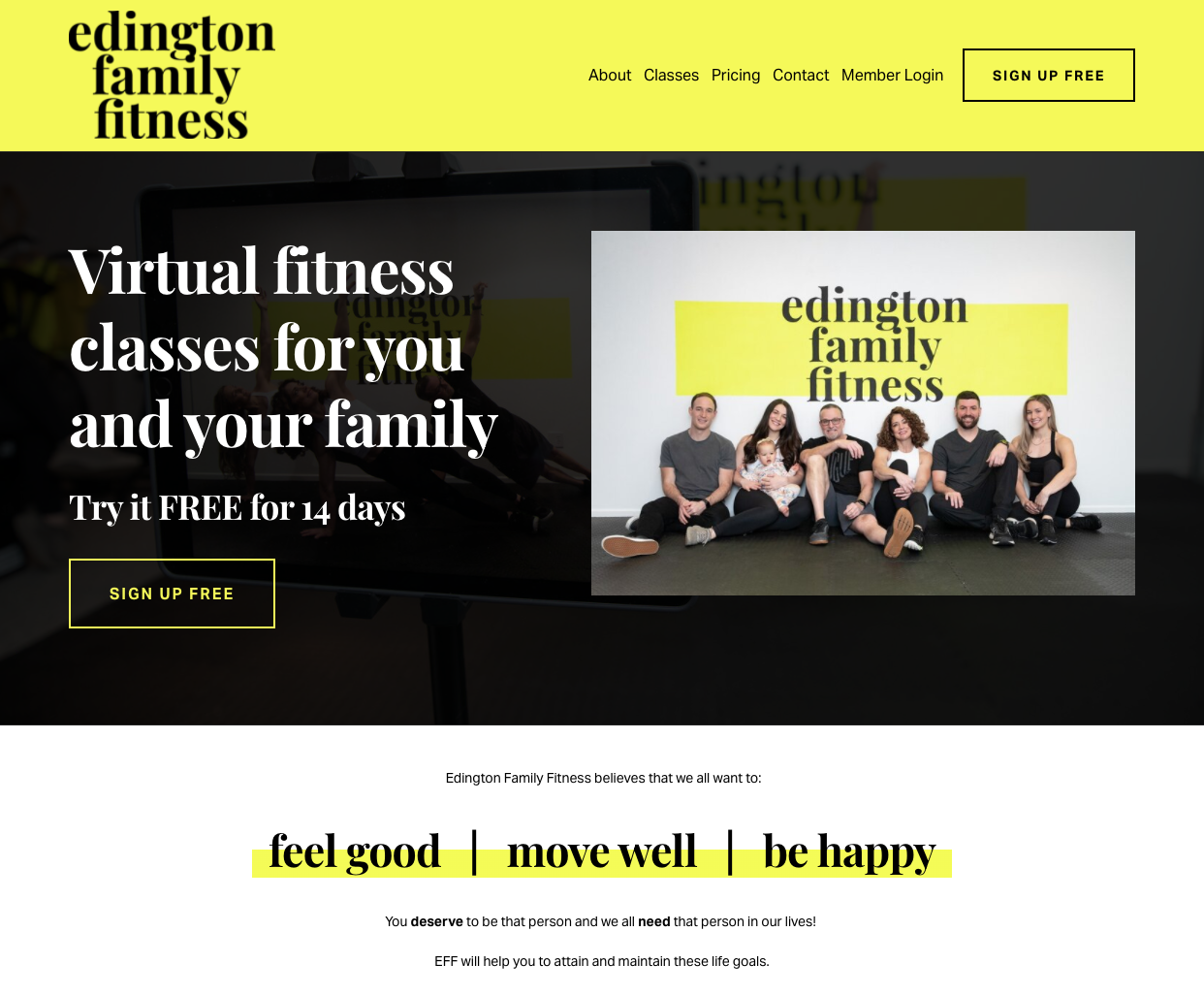
Example: https://www.edingtonfamilyfitness.com/
Edington Family Fitness has yellow as key brand color but note: we are not using the yellow as text or putting white text on the yellow. This keeps the text contrast readable.
When it comes to fitness website ideas, accessibility is not a fad. Just like you design workouts with accessible modifications for your clients, it is vital to consider the abilities of people who read your website.
Reading a website can be particularly challenging for individuals with vision-related issues. To ensure they have the best experience possible, you should ensure that:
Your text has the proper contrast.
You're not relying on text graphics that you uploaded to your site. Screen readers (& google!) don't identify this as actual text.
Your headings follow the proper hierarchy: one H1 at the top, then H2, and H3 repeated down the page as needed.
Tips for a more accessible fitness website
Add a colour overlay between any image backgrounds and text to make the words stand out from the background and pop more. Modern websites have a more “crisp” vibe, largely due to the increased awareness of accessibility needs.
#6. Diverse and Branded Photo Shoots
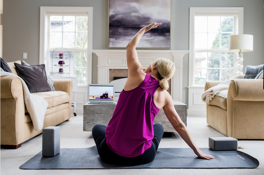
Example: Twist Yoga’s at-home photo shoot to show off their video offers in a realistic context
Photos do more than fill space—they tell your brand story. One of the most powerful fitness website design ideas is showing real, diverse clients in your imagery.
As someone who runs a fitness or yoga studio, you know that people come in all different packages, and exercise and wellness activities can happen anywhere. Having the photos you choose to use on your website helps paint a picture for potential clients.
Consider the group's composition when selecting participants for your next photo shoot. Are you representing different ages, genders, races, or body types?
You want people to see themselves reflected in your brand and one of the best ways to demonstrate that is by choosing people who represent your clientele.
Additionally, consider all the various ways you offer your services. If you run a studio, offer in-home services, and provide private and group sessions, consider how you can capture these aspects in your images.
Create branded photos that showcase the various ways people can work with you. And don't forget, these branded photos don't only have to be used on your fitness website. Social media is a great place to get your studio noticed, and your branded photos can help showcase what you do.
Tips for better branded fitness website photos
Download my Website Photography Guide for Fitness Studios for a free checklist to help you plan your next studio photo shoot.
#7. Accordion Text
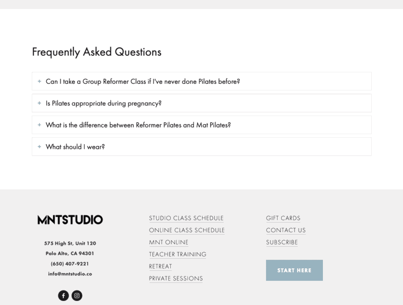
Accordion example: https://mntstudio.co/new-to-mnt
MNT Studio uses a Squarespace accordion block to display frequently asked questions in an visually attractive, interactive way.
Of all the different fitness website ideas we're discussing, this one may sound unfamiliar, but you've definitely seen it in action.
Let's say you're on a website looking at a list of frequently asked questions. Each question has an arrow or icon underneath that you click to expand the box and see the answer. That's accordion text!
Accordion text is beneficial if you have a lot of information you want people to easily access but want to maintain a crisp and clean look on your website. And yes, Google can still “see” the text that’s in the accordion so it won’t hurt your SEO!
Tips for using accordion text on your fitness website
In addition to FAQ’s, accordion text is a great option if your class descriptions are long. You can display a short sentence of each and then use a single accordion as “read more” text to dropdown additional info. Adding accordion blocks in Squarespace is easy—just look for the block option instead of adding a regular text block.
#8. GIF Thumbnails
Even if you choose to focus on video as one of the key fitness website ideas you want to incorporate in 2025, you need to know that not everyone will watch those videos in their entirety or at all.
That's why GIF thumbnails make a great addition to your design plans. You can use video thumbnails on any video on your website. Choose the images carefully, or upload a short looping GIF instead.
Tips for greating GIF thumbnails
If you use Vimeo to host your videos, you can create a thumbnail GIF right from Vimeo. Easy!
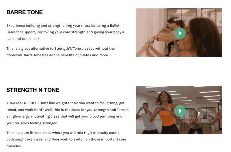
Example: https://www.dancedynamics.com.au/fitness
Dance Dynamics uses gif thumbnails to show a preview of each of their class descriptions. Clicking the video gives a more in depth explanation, but the gifs add energy and show a snapshot for those that don’t watch the full video.
#9. Thank You Pages with a VIP Experience
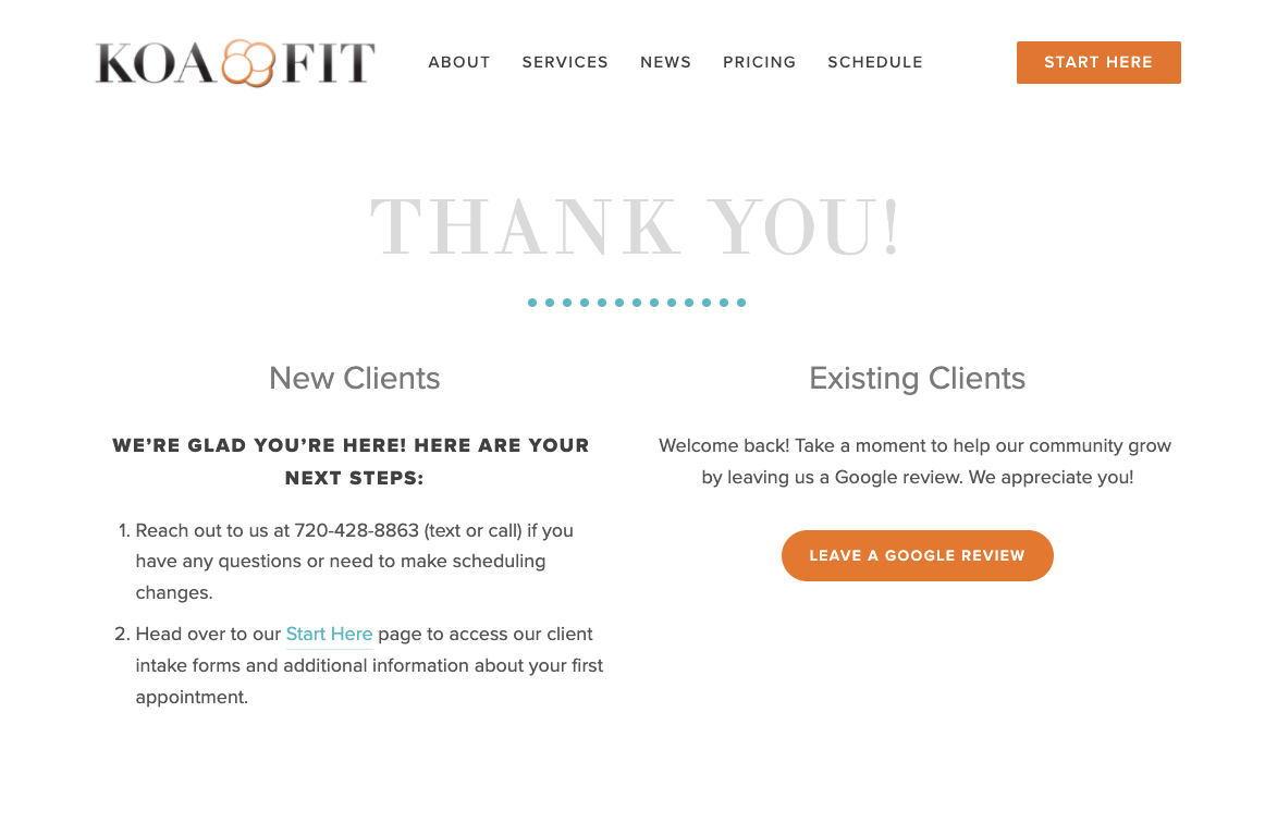
Example: https://www.koafitusa.com
KOA Fit USA uses a Thank You page with their Mindbody booking software to guide new clients to booking their first session and returning clients to leave a review.
When a new client signs up for a service, class, or program on your website, what happens after they complete their purchase?
A redirect to a thank you page is a fantastic way to start things off on the right foot. At the point in your client's journey when someone makes a purchase, they're already engaged, so now is the time to take advantage of that.
Your thank you page can include all the helpful information they may need, such as the next steps for booking a class, valuable links, requests for a Google review, frequently asked questions for beginners and more.
Tips for creating a better post-purchase experience
Check with your scheduler and email marketing provider to determine your options. You may be be able to redirect the user, or you may have space to add a unique message.
Fitness website design ideas to leave behind in 2024
Before you start making your list of which fitness website ideas will make the most sense for your business in 2023, it's also essential to take stock of what you currently have in place.
If you're embarking on a refresh or redesign, you may have gathered some ideas by looking at other websites, but just because something appears on a website doesn't mean it's current. Trends in design come and go, and there are definitely some fitness website ideas that should be left behind in 2023.
Top on my list: scrolling banners with changing text. While video and images that rotate are lovely, the text itself should stay static.
Why? The rolling text is complicated to read, and the information you're communicating will likely not be absorbed.
Text on images can also be problematic on a website. More and more people are getting comfortable with design platforms like Canva — which is excellent — but when these images with text are exported and placed on the website, they may not display correctly. This image text is not only not visible to Google but can't be read by screen readers and doesn't resize to remain readable on all screen sizes.
Finally, avoid trendy color combinations with low contrast. This includes muted tones of tan, rose-coloured pinks, or retro dusty blue. While these may look amazing as part of your home decor, they are challenging to combine in a readable way—especially when text is involved. If colors in these ranges are part of your brand's color story, ensure you also have high-contrast options for any text.
Fitness Website Design FAQ
-
Fitness website design costs vary widely—ranging from $3,000 to $10,000+ depending on features, integrations, and customization. Pixality Design’s most popular website package is $4,750.
-
Project length for a fitness website design can vary based on size of site and responsiveness of the designer. At Pixality Design, most website projects are completed in 2 week project timelines.
-
A great fitness website design is clear, visually engaging, and easy to navigate. It quickly tells visitors who you are, what you offer, and how to take the next step—whether that’s booking a class or starting a trial.
-
Every fitness website design should have a clear home page, class schedule, pricing, about page, contact page, and a page for new client special offers. A FAQ page is an important but often overlooked page that should also be incorporated into your fitness website plan. These pages answer key questions potential members have before joining.
-
SEO—short for Search Engine Optimization—is the process of improving your fitness website so it shows up higher in Google search results when people look for services like yours. Strong SEO helps your site get found by local prospects searching for “yoga near me” or “best Pilates studio in [your city].” Without it, even the best-looking fitness website design may stay invisible online. Optimizing your site for SEO means more traffic, more leads, and ultimately, more members.
-
Many studios choose platforms like Squarespace, Webflow or WordPress for fitness website design because they’re easy to update, SEO-friendly, and integrate with scheduling tools like Mindbody or Mariana Tek.
At Pixality Design, we build fitness studio websites on the Squarespace platform because it offers the perfect balance of ease-of-use for owners and design flexibility for creating a standout brand experience.
-
Most fitness websites connect to a studio scheduling software—like Mindbody, Mariana Tek, Momence or Walla—that handles class bookings, and payments. These tools integrate with your website so visitors can view schedules, reserve a spot, and pay online without leaving your site. This creates a smoother experience for your members, reduces admin work for your team, and ensures all bookings sync with your studio’s calendar in real time.
-
Current trends include video backgrounds, bold, oversized typography, and hover or scroll animations. Big, beautiful photography continues to be a hallmark of modern web design.
Leverage these fitness website design ideas in 2025
Are you planning a website refresh or rebrand in 2024 and trying to decide which fitness website ideas to incorporate?
Trying to find the right fitness or yoga template to build your website from?
Looking for support with website development from a seasoned pro who can bring your design vision to life?