
Pilates Website Design Guide: Create the Best Pilates Studio Website

Creating a new website for your Pilates studio can be a big undertaking. From nailing down your branding to having impactful website content, your Pilates website design needs to be well planned and executed.
Before you start panicking and thinking about how you can possibly get this done, here’s some good news:
Your website is never actually ever done. Your business and your website will evolve, so it doesn’t have to be absolutely perfect. In fact, when working with clients on their Pilates website design, I encourage them to have a bit of fun with being creative.
Like any other website, a standout Pilates website design is all about ensuring your visitors have a seamless experience. You want to ensure that they can get exactly what they need when they come to the website, whether it’s booking an appointment or learning more about you and how you run your studio.
To help you get started, I’m sharing an overview of what you must consider when undertaking Pilates website design.
Table of Contents
Determine the Budget for your new Pilates Website
Even if you don’t have a lot of cash to invest, your website should be a top priority. If your business is in the early stages, you may think your website isn’t necessary, but it absolutely is! You may have to start with a simple Pilates website design and then update it later.
Your budget will affect whether or not you hire a website designer. As someone who does this for a living, I never encourage people to spend more than they can afford. If pricing for the project is a concern, I suggest focusing on some key areas to get the most out of the budget you do have.
Some of the things I consider most significant include:
Investing in photos. Photos are brand assets you can use across your marketing efforts, not just on your website. Focus on quality or over quantity.
Choosing a user-friendly platform. Some platforms are easier to manage than others, so you’ll want one that makes sense for you. Your main goal is to choose one that you’ll feel comfortable doing some basic functions like editing texts and images. (I’m a big fan of Squarespace as it’s user-friendly and offers plenty of website templates.)
Defining your brand voice. Your brand voice needs to be clear, focused and consistent.
With these things in mind, let’s dive deeper into some key areas you’ll want to focus on to create a successful Pilates website design.
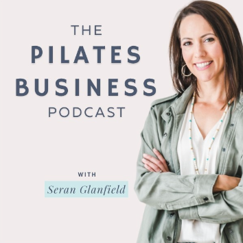
Interested in Pilates Website Design?
Listen to my interview on the Pilates Business Podcast with Seran Glanfield!
Nail Down Your Pilates Studio Brand Messaging
Before you even start writing a single piece of content as part of your Pilates website project, you need to have your brand voice nailed down. Your messaging should speak to what makes you stand out from your competition and what makes your studio unique.

The Fitz Pilates website design showcases their fun and distinctive brand voice.
Think about what makes your studio special. What do you love about it? What’s the atmosphere like in your studio? What kind of experiences do you want your clients to have? Why should they choose Pilates as part of their fitness routine?
Other questions to consider:
Why are you in business?
What passion drives your business?
What is your mission?
What do you want your business to be known for?
Most of all, what’s in it for them — the people who work for you? Why do they choose YOU?
All these things together make up your brand voice, which should be consistently reflected throughout your Pilates website design. This exercise will also come into play later when you’re building your social media presence, as you can communicate in a clear voice consistent with your brand and messaging.
Design Your Pilates Brand Look
Visuals are so important for Pilates website design because they help people quickly and easily identify who you are and what your business is all about. Not everyone will take the time to read your website copy, so you need to make an impression with the images you choose and your logo design.
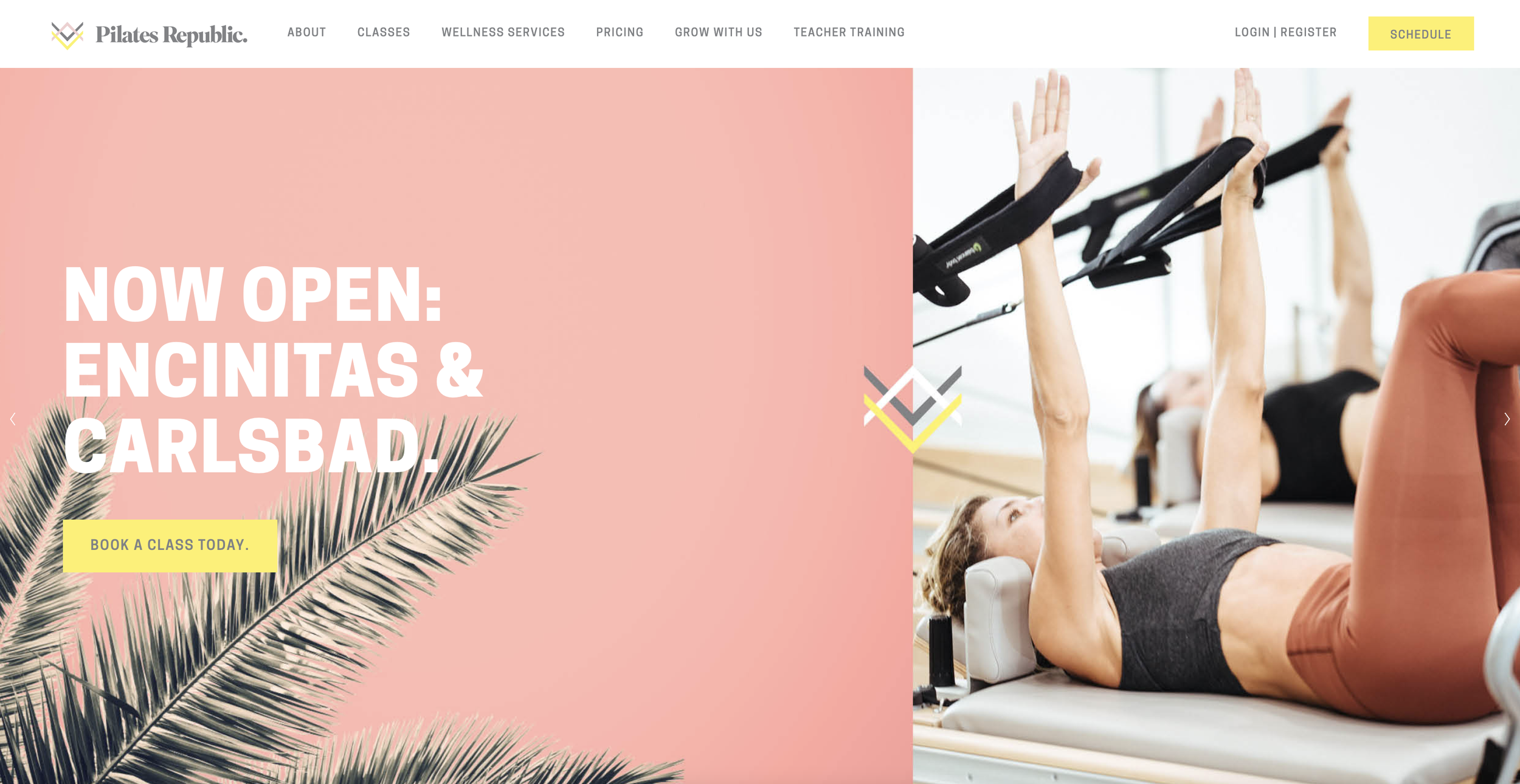
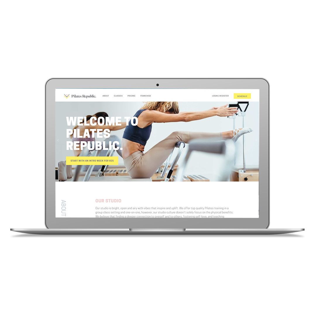
The Pilates Republic website has clearly defined visual brand elements and professional photos
Ever heard of the blink test?
The idea is that someone should be able to quickly scan your website and in the blink of an eye glean some key pieces of information:
What type of business it is?
What type of things can I buy?
Where is this business?
Where do I click next?
As I mentioned above, I greatly advocate using real photos — not stock ones. Original photos add a layer of authenticity. Website visitors can see you, your studio and how you work with clients, which is an excellent hook for potential clients researching local studios.
You don’t need to do a photoshoot and get hundreds of images, so this doesn’t have to consume a considerable amount of your budget.
A few tips for what to look at when getting great photos to use for your Pilates website design:
Are photos of my real location, instructors and clients?
Are my photos well-lit and not blurry?
Are there faces of real people? Smiling, interacting?
Do my photos accurately represent my services and clientele?
Do my photos accurately represent the in-person vibe of my Pilates classes or services?
Plan Your Pilates Website Content
Website content should be clear, concise and make an impact. One of the worst mistakes someone can make is having long, boring, and dry copy. Attention spans are short, and people want to get the information they need quickly.
When in doubt, always go shorter and simpler, as this will strengthen the overall effectiveness of Pilates website design. Clarity wins out every single time.
Start by planning out each page so you are clear on the intent of the page and what action you want the visitor to take is critical. Don’t just start writing a landing page without a plan for ALL the pages you need and what purpose each one will serve.
Remember, website copy should always be client-centered. It should be about the reader—what they want and need and how you can help them get there. It should also maximize opportunities for search engine optimization so that your studio can be found easily online.
Finally, the content you create to support your Pilates website design shouldn’t just be focused on words. Video is an incredible medium for capturing people’s attention and relaying information quickly and effectively.
Not sure what type of video content would integrate well with your Pilates website design?

In addition to showcasing on-point client testimonials, Ross Pilates makes new clients feel comfortable by providing a video tour of the studio and equipment right on their website.
Try a few of these:
About you/the studio
Client testimonials
Case study
Ads
Explainer/how-tos
Vlogs
Interviews
Product reviews
Live streams for Pilates classes
Create a Website Path for Action
Having a strong website design is all about moving visitors from A to B. As you work on your Pilates website design, you need to think about where you’re trying to get people to.

The Pilates Project makes navigating their site easy with clear action buttons at the top right of every page
The best way to do this is to walk through your website like a new client would and answer each of these questions:
Do I have to leave the website to book or buy?
Does the website have a security certificate (ie. https)?
How much information do I need to enter to checkout? Are all items necessary?
What happens after I complete the transaction? Am I left at a dead-end or am I redirected someplace useful?
If you want website visitors to take action, you want to make it as frictionless as possible. People are impatient and the more barriers you can remove, the better their overall experience will be.
Pilates Website Design FAQ
If you’re planning or refreshing your Pilates website, you probably have a few questions about what works best for attracting and converting new clients. Below are answers to the most common questions Pilates studio owners ask about creating a website that’s both beautiful and effective.
-
Yes. Professional photos make a huge difference in the feel of your website and help communicate the quality of your classes. They additionally build trust with your potential clients who need to feel comfortable walking into your space for the first time. Include images of your studio space, equipment, instructors, and clients in action to help visitors picture themselves there.
-
At a minimum, your Pilates website design should have:
A homepage that communicates your location, offerings, and first-step offer.
Class schedule or timetable page.
Pricing page with package details, or at least a base price for new clients
About page that shares who’s behind the studio and why the space was created.
Contact and location information, including a link to your google map listing!
-
Integrate your scheduling software directly into your Pilates website design. This lets visitors view your most up-to-date class schedule and reserve a spot without leaving your site, reducing drop-offs and making sign-ups faster.
-
Popular options for primarily class-based Pilates and Lagree studios include Mariana Tek, Momence, and Walla.
Pilates studios that offer a mix of group classes and private appointments often use Mindbody or Momence for their studio scheduling software needs.
All the scheduling software listed above have options to seamlessly embed booking widgets into your Squarespace website so clients can book and pay without leaving your website.
-
Yes. A well-optimized Pilates website can improve your visibility in both Google search results and AI-powered tools like ChatGPT. For Google, this means using Pilates-related keywords, optimizing page titles and descriptions, creating high-quality content, and making sure your site loads quickly on mobile devices. For ChatGPT and other AI assistants, your site needs clear, well-structured information that’s easy for AI to understand—things like up-to-date class schedules, detailed service descriptions, and accurate contact details. The more authoritative and user-friendly your Pilates website is, the more likely it is to be surfaced when people search for local Pilates studios or ask AI tools for recommendations.
-
Some common pitfalls include:
Not showing pricing or making it hard to find.
Using low-quality images.
Failing to optimize for mobile.
Making booking steps too complicated.
-
The cost of a Pilates website can vary depending on the designer’s experience and skills and the website's size.
A ballpark price for a professional web designer to build your Pilates website on a platform like Squarespace or Wordpress and integrate it with your scheduling software is $5,000, however this can vary a lot based on your needs and location.
If you want to learn more about Pixality’s Pilates website pricing, you can find more information right here.
5 Common Pilates Website Design Mistakes
Pilates studio businesses have some unique challenges when it comes to their websites. Here are 5 of the common mistakes I see on Pilates websites specifically and what to do instead:
Make sure your location is clear. In this world of plentiful virtual fitness options, your IN PERSON class or private instruction experience is your biggest differentiator so you need to clearly display your city and state on your home page. Websites that win reassure visitors right away that they are in the right place.
Show don’t tell when it comes to your equipment. I know there’s nothing Pilates instructors like better than talking about the latest model of reformer, but you’re clients… especially your new ones, don’t really care. Keep the sales conversation on your website client-focused and show off that beautiful equipment in photos instead.
Keep your pricing page simple. I know… it’s tough.. Pilates studios especially tend to have a lot of pricing options when you take into account group classes, privates and duets. This can often result in a huge overwhelming pricing page. But you don’t have to list ALL your prices online. Choose the 3-6 pricing options that most people start with to help people take that first step.
Include social proof. Let’s be honest, Pilates is probably one of the more expensive boutique fitness options your prospect is looking into. Including relevant testimonials throughout your site can go a long way to show that that investment is worth it.
Promote a new client special as the clear first step. Trying something new can be intimidating… so make sure your website clearly guides readers to an easy first step—one that lets them sample how Pilates will make them feel without a huge commitment.
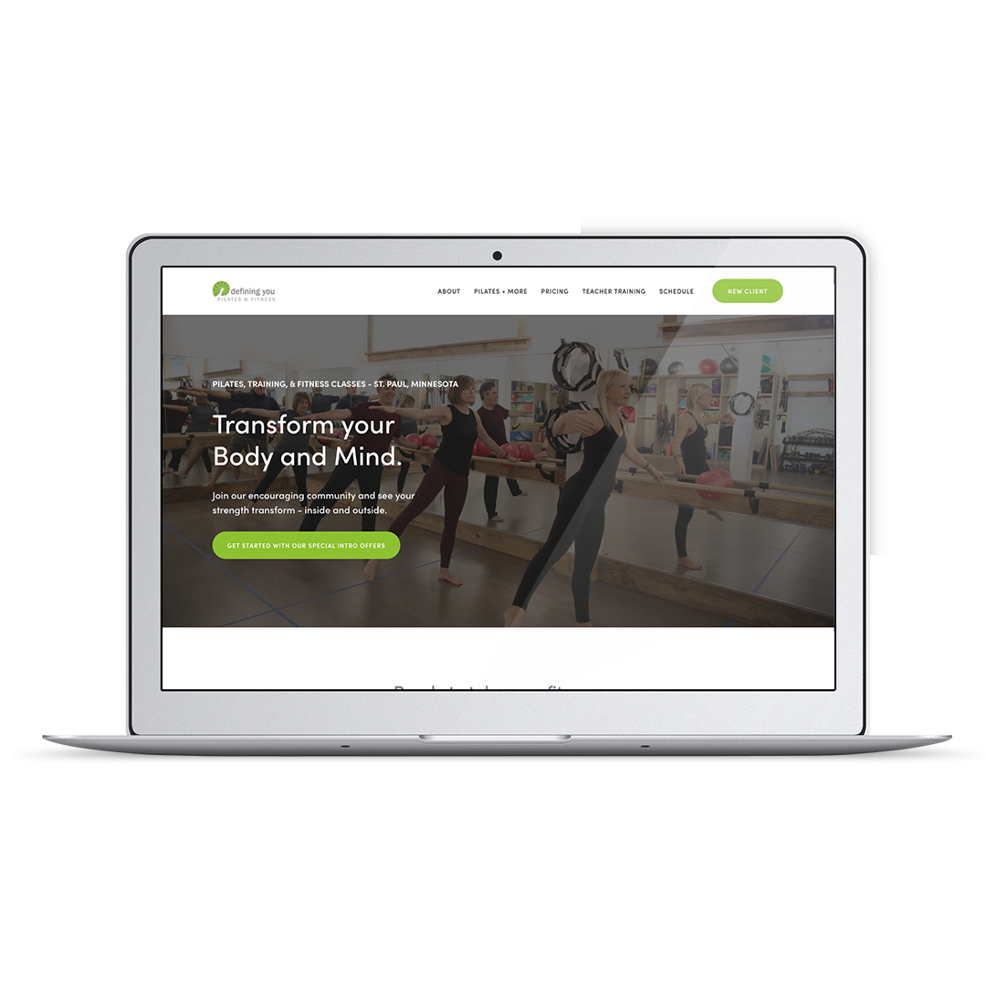
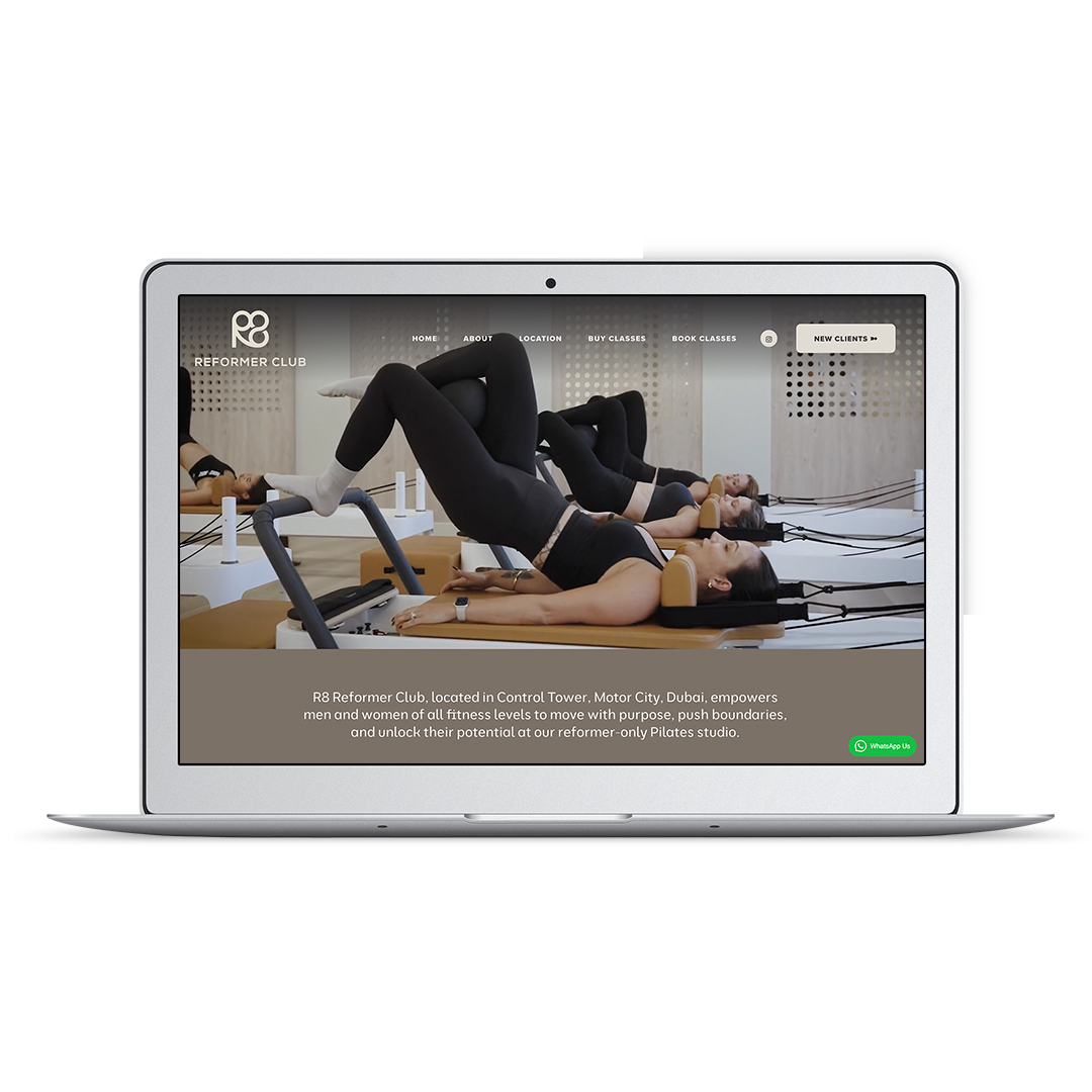
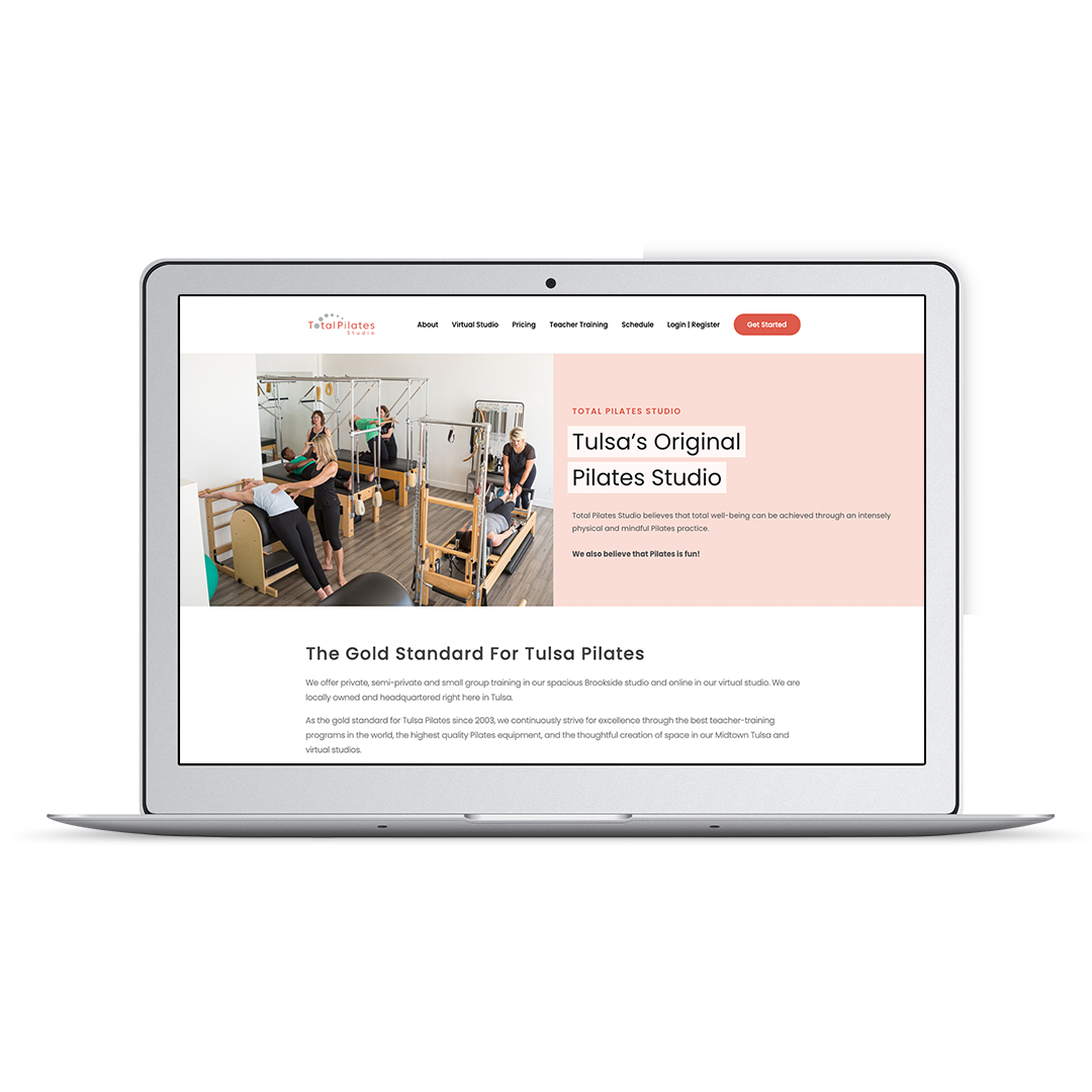
Pilates Website Design Examples by Pixality Design:


Nailing Your Pilates Website Design
Now that you have a better idea of what’s involved in Pilates website design, you may think that undertaking all this is out of your comfort zone. And that’s totally okay!
If hiring a web designer to help with your Pilates website design is something you’re considering, it’s in your best interest to make sure you ask the right questions to make sure they’re a good fit.
Whichever route you decide to go — DIY or hiring a designer — with a little bit of planning to ensure all the key elements are in place, you’ll achieve a Pilates website design that helps you meet your goals.
Looking for a designer to help you nail your Pilates website design?
Here at Pixality, I’ve worked with over 150 fitness, yoga, and Pilates professionals to create easy-to-manage websites that reflect their brand vibe and goals. You can even check out examples of web design projects, and read reviews from our clients.
If you’d like to chat about how I can help, contact me to get started.