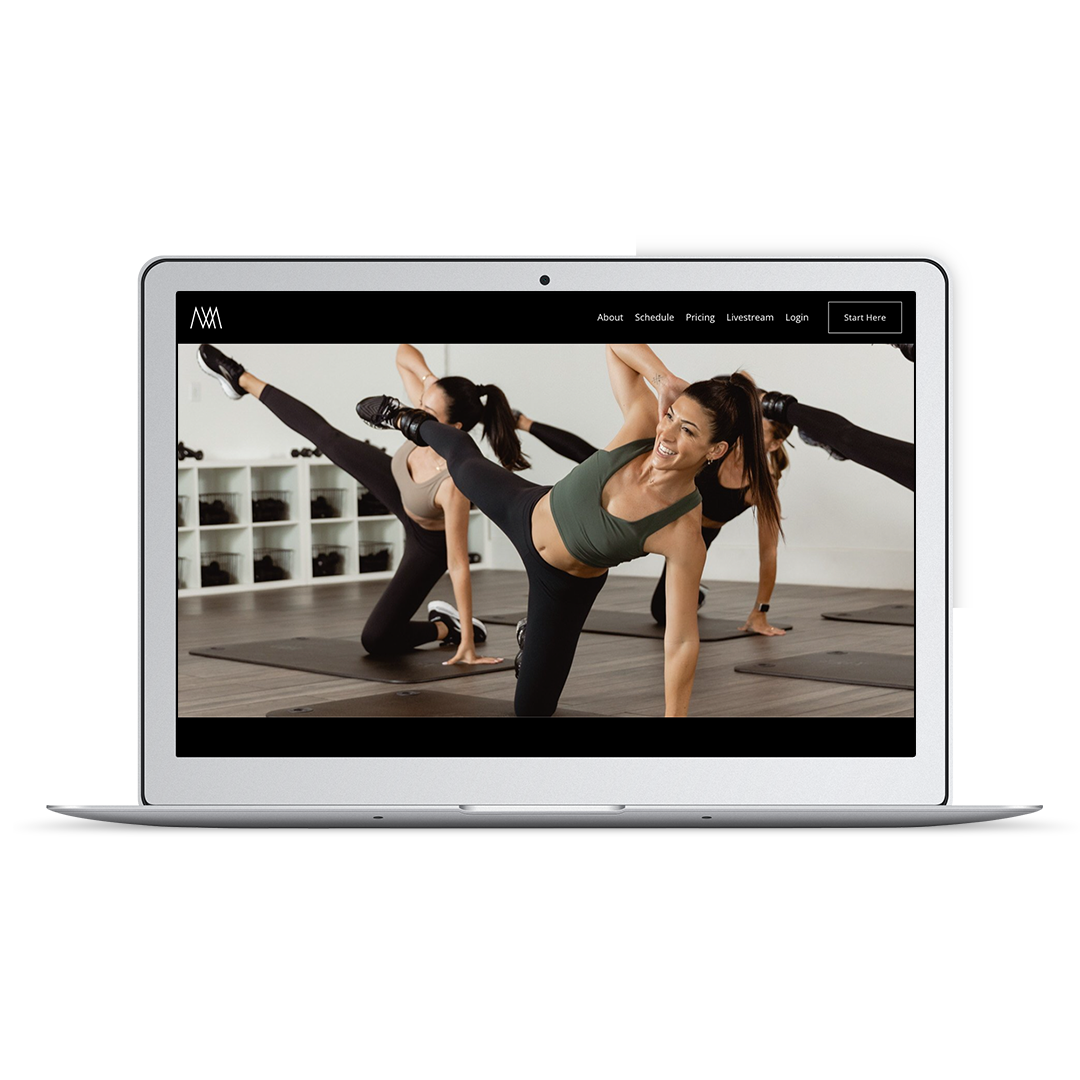
Your Go-To Guide for Creating Mindbody Websites
A while back, I had the opportunity to collaborate with Mindbody on a project designed to help new business owners understand everything they need to know to build Mindbody websites for their fitness or wellness businesses. It included creating a comprehensive checklist of everything you need to make a professional website that converts casual browsers into clients.
As a website designer, one thing I love about Mindbody websites is all of the great out-of-the-box widgets they offer. While some people decide to go the DIY route with their website design, working with a designer who can customize these widgets for your brand can take your website to the next level.
The reality is that from domain details to page preferences, there are countless things to consider and learn as you build a website.
To help you better understand what's involved, I'm sharing some tips on building Mindbody websites and a few examples of how great your website can look!
Where to begin when you need a mindbody-integrated website
You already know that your Mindbody website will be a critical hub for your business, so ensuring it has a welcoming and user-friendly design is vital. What you need to know is where to begin.
Website development happens in two phases - design and building.
The design phase involves deciding how your website will look. You must choose which pages to include, how the content will be organized, and how users will navigate the site. You’ll also choose images, fonts, and colors.
After designing, the website needs to be built. This means converting your design into code web browsers can read and show. In the past, you needed to hire both a web designer and a web developer. The good news is many designers and platforms now do both simultaneously!
If you still need to do so, registering your domain name (ie. studioname.com) should be at the top of the list. Domain name availability can be checked via any company that offers domain name registration, with people commonly using GoDaddy, Hover, Dreamhost, or Namecheap.
Once your domain is registered, you must choose the platform on which your Mindbody-integrated website will be built. Website platforms vary significantly in price, features, ease of use, design flexibility, support, and security. Regardless of your platform, you can expect to pay a few hundred dollars annually for your website's theme and hosting.
Also, remember to ensure that whatever platform your Mindbody website is built on is mobile-friendly. More people than ever are relying on their phones to look up information, so you want to ensure that if they come to your website that way, the experience is just as good as it would be on a desktop. Squarespace is my platform recommendation of choice, and is the platform I build all my client sites on. Learn more about using Squarespace for your fitness studio’s website here.
Next step: plan your structure and content
The main goal of your website should be to make it easy for visitors to become clients. This depends on how simple your site is to navigate. Think like your clients and consider what information they need to take the next step with your business. Your website should seamlessly guide them, giving them all the necessary information without hassle.
Keep in mind that people are busy. More information isn't always better. Too many pages or options can quickly overwhelm or frustrate visitors. That’s why you want to ensure that every part of your website has a clear purpose.
Also, choose clear naming conventions for your pages. You want people to know where to go and be able to get there fast. Easily identifiable terms like Pricing, Rates, Schedule, or Book Appointment make it easy for your clients to find what they're looking for.
Once you've settled on the structure of your Mindbody website, it's time to think about your content. This is the written copy that will go on each page.
While people often feel the urge to fill all the space, when it comes to copy, being clear and concise without too much extra fluff will serve you much better. Your choice of words is integral to your website's being found by your target clients and ensuring your brand message connects with readers.
Well-written website copy is:
SEO-rich: Optimized to help you rank on Google for your chosen keywords.
Emotive: Elicits an emotional reaction.
Persuasive: Prompts prospective clients to take action.
Finally, when writing your website copy, your overarching goal should be to ensure your website's primary pages are client-focused and clearly show your clients' next steps.
Creating your pages
It should be no surprise that the Home page on your Mindbody website needs to pack a punch. People usually land here first, so you want it to be impactful.
When someone lands on your Home page, they should be able to find the answers to these questions quickly:
Who are you?
What do you offer?
Where are you located?
How do they get started?
Your Home page is critical to your being found in a search, so answering these questions off the top will help alert search engines that your business is legitimate and a viable option for related searches.
When designing your Mindbody website, you’ll also need images. This is the first impression you make online, and if the visuals aren't appealing, potential customers may decide to look elsewhere.
Research shows that the average person spends less than 15 seconds on a website before leaving, so it’s vital to capture their attention immediately.
As someone who has designed hundreds of websites for fitness and wellness clients, I’m a huge proponent of using photos that show real people in your real space. High-quality photography is one of the most essential elements of your Mindbody website. You want people to get a sense of what their experience with your studio may be like, and photos are a great way to capture the atmosphere and values of your business.
From there, you can move on to building the other needed pages. I recommend focusing on the following pages:
About / Class Descriptions Page
Intro Offer/New Client Page
Pricing Page
Scheduling Page
Frequently Asked Questions
Contact Page
Also, remember your footer. It should be the same across all the pages on your website and include your business name, address, and phone number, a link to your Privacy Policy page and any social media links.
mindbody websites examples
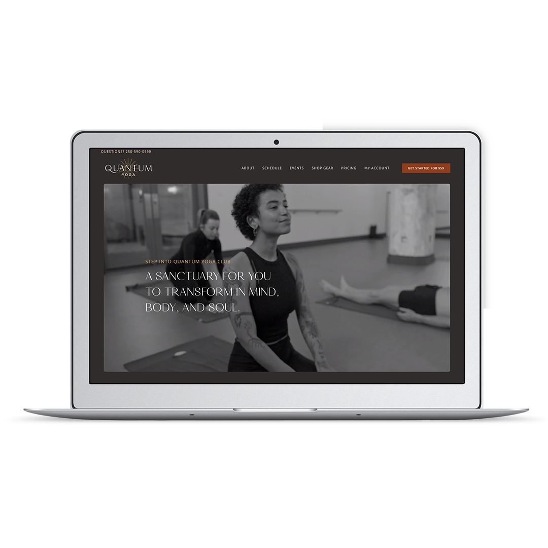
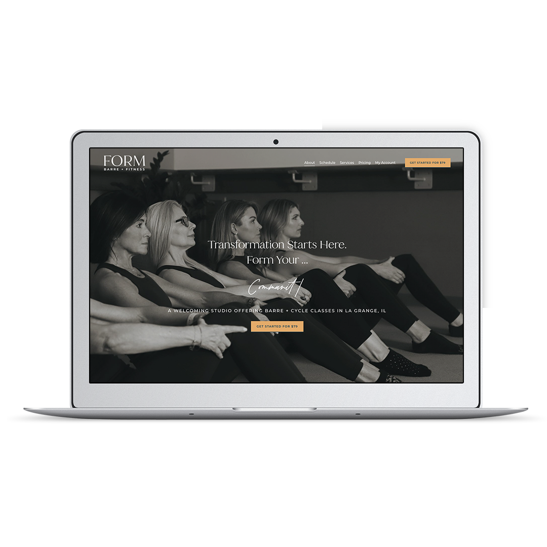
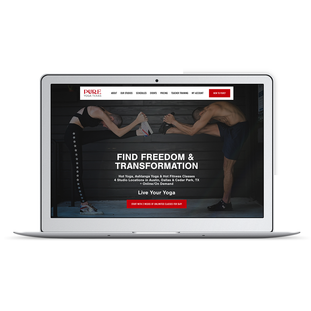
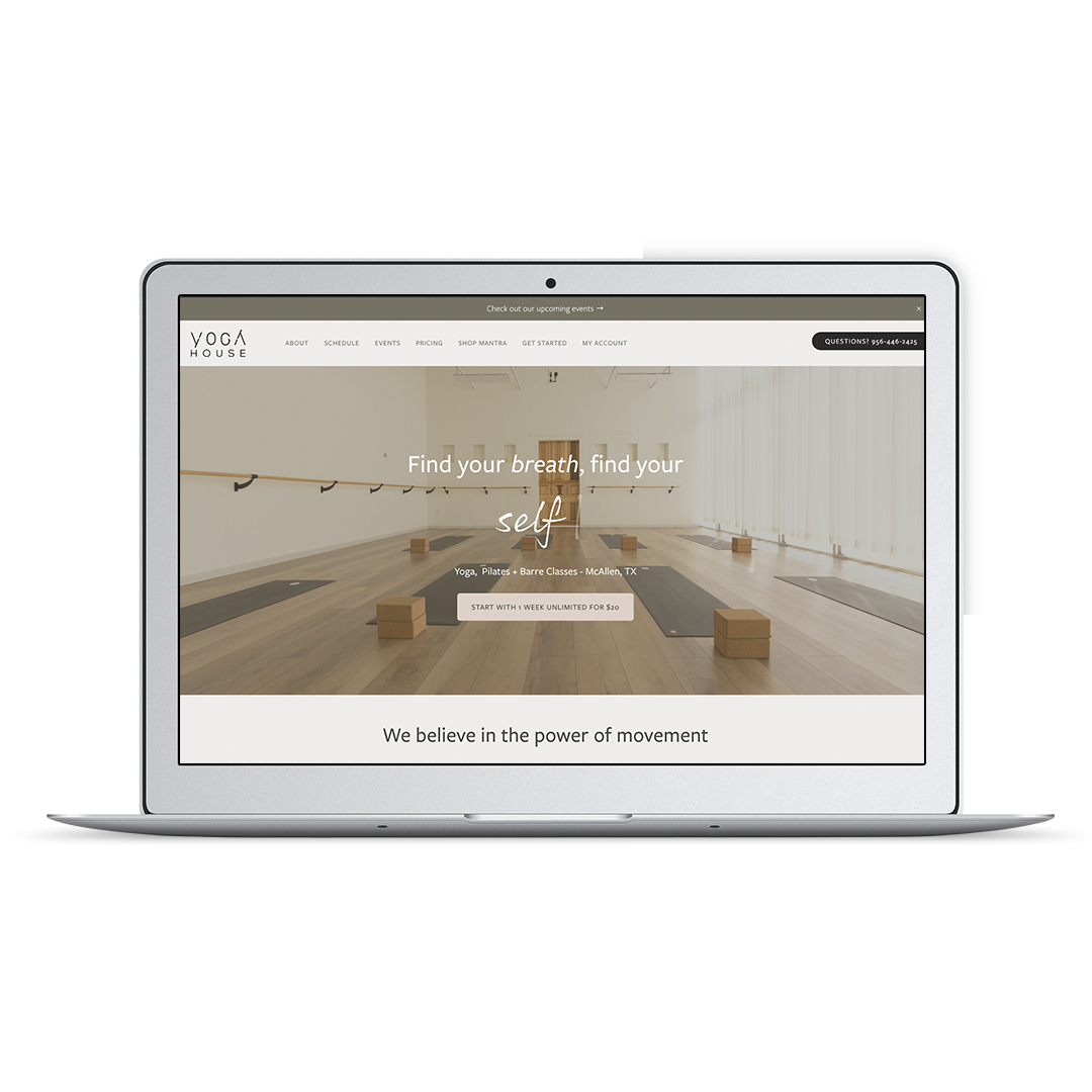
Pixality has built hundreds of Mindbody websites to support fitness, yoga, pilates and wellness studios.
Here are some examples:
As previously mentioned, one of the most incredible things about Mindbody websites is the ability to create customized integrations. Here are some examples of Mindbody widgets that have been customized using CSS:
Location-selector pricing cards linked to Mindbody cart overlay buttons
Mindbody Team widget with bio “read more” links and grid layout
Mindbody enrollment widget customized with icons on featured information
“Waitlist Full” annotation on Mindbody Schedule widget (the default is a blank spot, which can be confusing!)
Get Support Building Your Mindbody Website
As you can see from the breakdown outlined above, building a Mindbody website that takes advantage of all the possible integrations is only half the challenge. You also want a well-designed website that showcases your unique brand and is easy to manage.
Are you seeking support in creating your ideal Mindbody website and fitness brand design?
Pixality Design’s Connie Holen is a digital strategist, designer, and Certified Mindbody Business Consultant who can help you create a studio website that gets noticed.
Pixality Design offers branding and website design services for fitness studio owners.
Contact us to see how we can help!


